
Designing for Phanes Biotech
Fall 2023
Background
Phanes Biotech is a research start-up developing therapies to cure patients suffering from neurodegenerative disease, based in Philadelphia. Focused on developing molecules to prevent, inhibit, and reverse neurodegenerative diseases and developmental disabilities by neural regeneration, they are an early-stage drug development biotechnology company.
As an early-stage start-up without a designated designer, Phanes Biotech needed to refresh their website to make it more visually appealing and inviting. I led the design process from beginning to end, and asked the right questions to narrow down my focus for this redesign.
Problem Statement
Target audience: investors & researchers
Research
Make it easier for investors & researchers to learn about Phanes Biotech’s work, mission, and impact.
Redesign the company website to make it more
user-friendly and intuitive
modern
easy to navigate and obtain information quickly
A vibrant, non-distracting color scheme & easy-to-read font that stays on brand with Phanes Biotech.

Future Steps
Further Testing: Conduct additional user testing to validate the latest prototype improvements, focusing on the community marketplace and visual aids in the "Advice" section.
User Retention Strategies: Develop strategies to keep users engaged over time, such as personalized plant care reminders or seasonal gardening tips.
Hand-off to developers
Takeaways
Designing for Static Sites: This was my first time designing for a page that wasn’t all about interactivity and userflows. Along with UX, I had to focus a lot on UI to ensure information was easy to grasp at a glance.
Iterative Process: Continuous feedback and iteration were crucial. Early testing highlighted areas where users struggled, driving visual and usability enhancements that improved the page’s functionality and satisfaction.
Before conducting research, there were a few key points to address:
It’s a static and purely informational website that users don’t visit regularly
Business constraints: only 2 designers
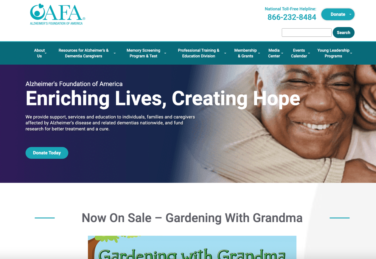
Competitive Analysis
Analyzed design choices made by various biotech start-ups.
My observations:
Informational hierarchy
Color usage
Use of white space
Font choice
Use of images & icons
Animations
Making the Home & About Us pages easier to navigate
Emphasizing Phanes Biotech’s mission statement
Highlighting the need for Alzheimer’s research
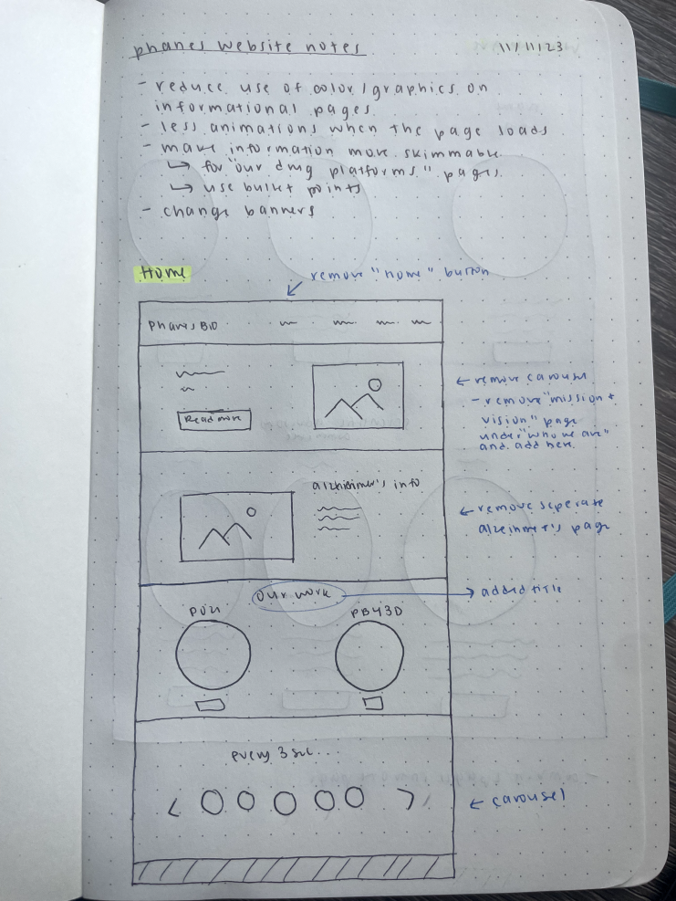
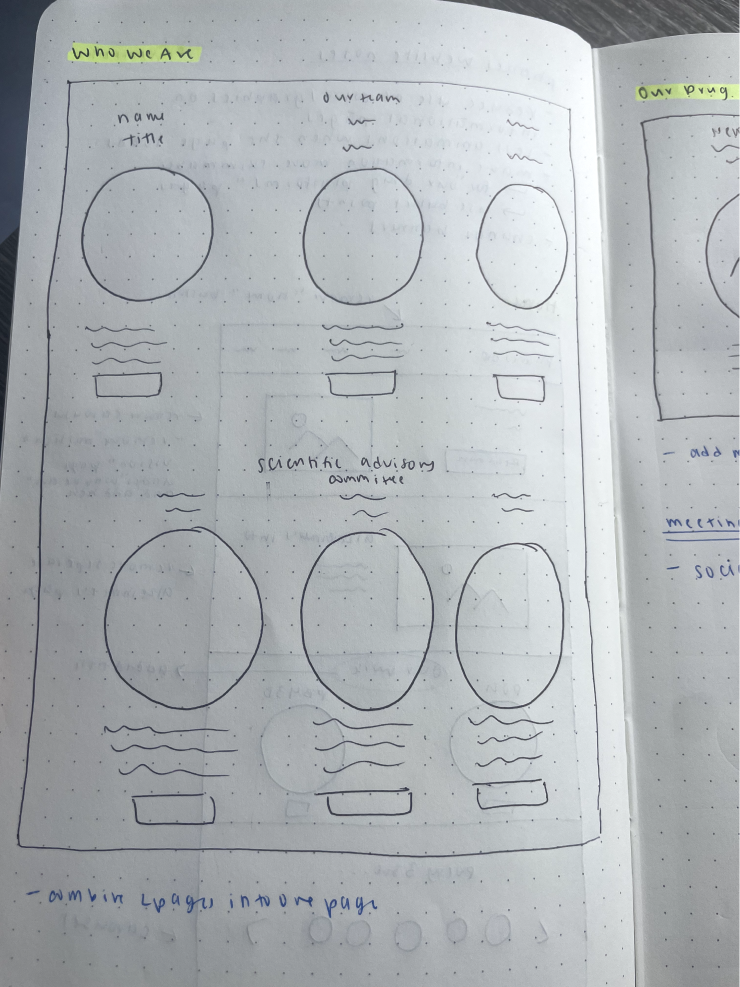
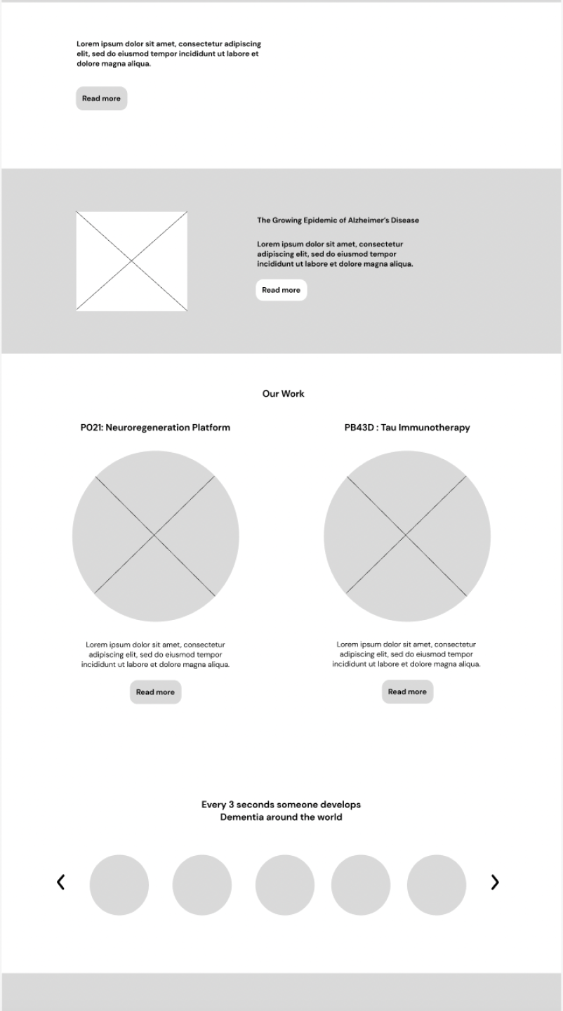
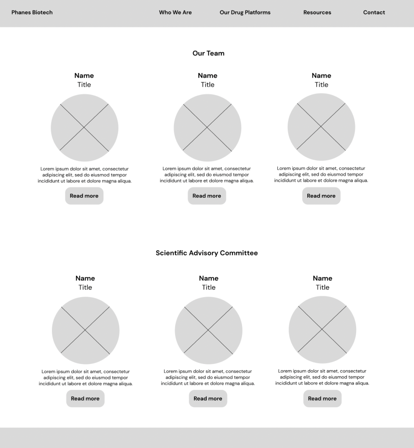
Sketches
I sketched out ideas for how we could refine the Home & About Us pages.
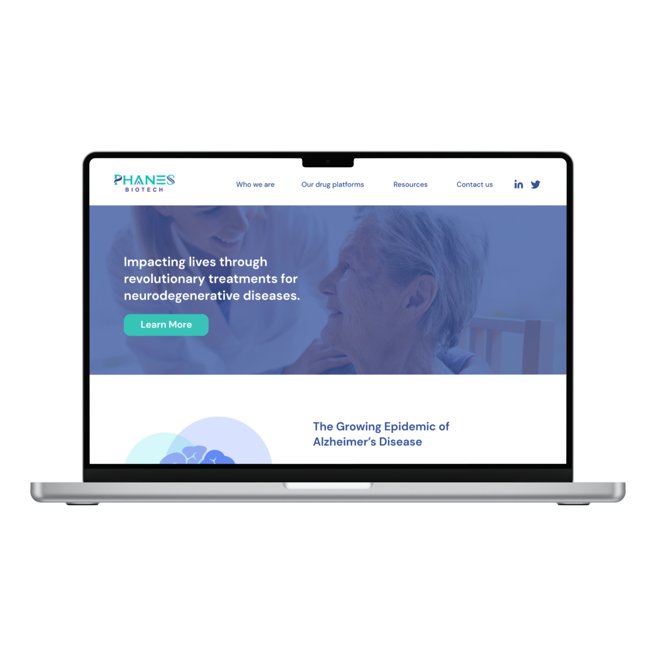
Current Website:
Problems I Solved
Addressing paint points
Reduced word content
Chose colors with less vibrance & better contrast
Used visual hierarchy to emphasize certain information
Use shapes & sectioning to make reading more easy to follow
User Research
We interviewed 4 people involved in research and asked them to share their thoughts and reactions as they navigated the current website.
Pain Points:
Difficult to digest information at a glance
Some pages are text heavy
Colors/graphics are distracting
Doesn’t feel very personal
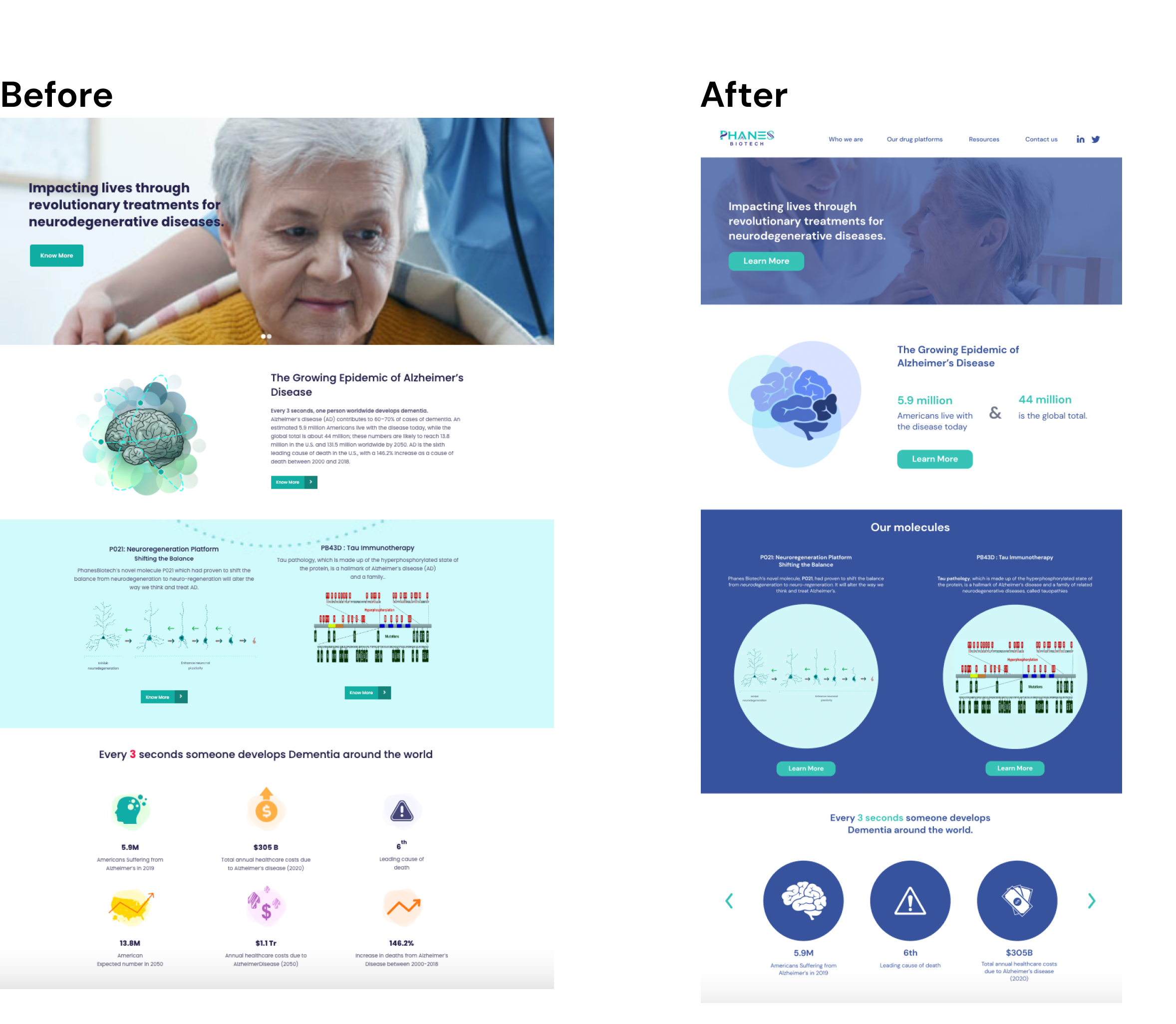

Final Design
I reviewed the designs with my team & the people we initially interviewed to ensure the website was easier to navigate, more visually friendly, and telling of Phanes Biotech’s purpose.
Home page
Images add to the text & don’t distract
Less distracting color scheme
Diagrams are easier to read
Icons all match the dame design style
Facts are easier to read at a glance
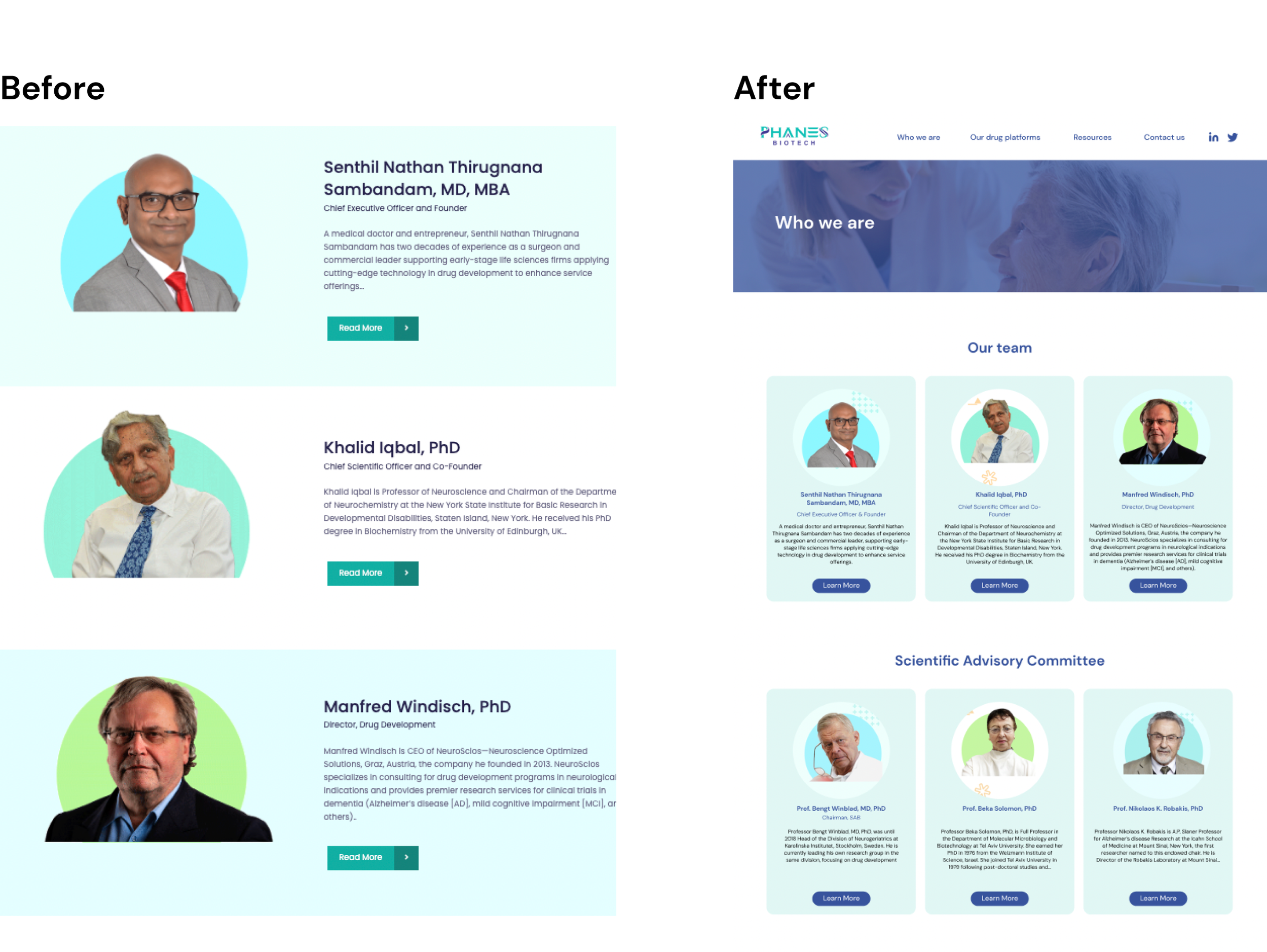
About us
Condensed two pages into one
Efficient use of screen space
Visually more enticing with all members at a glance
Similar to the theme of the rest of the website